Address Group
Solana Beach, California
Logo Design • Brand Identity System
Address Group is a real estate and property development company that transforms apartments, hotels, and commercial spaces through modern design and architectural excellence. Their brand philosophy mirrors the world of premium interior and architectural culture.
They approached us to develop a new identity that reflects who they truly are today:
modern, confident, design-driven, and quietly premium.
The Challenge
Address Group’s old identity felt dated and didn’t reflect their modern, design-driven approach to real estate. They needed a logo that looked minimal, architectural, and quietly confident—without using generic real-estate clichés.
The new brand had to appeal to a refined, design-savvy audience and stand comfortably beside brands like Apple, Airbnb, and SHOP Architects, while working seamlessly across digital, print, and on-site applications.
Our Approach
We created a bold, minimal identity built around a pure geometric red block holding the initials AG. This symbol acts as the anchor of the brand — clean, strong, contemporary, and instantly recognizable. The simplicity of the square mirrors architectural purity: form, balance, structure, proportion.
A modern wordmark paired with the block creates a high-end design language, perfectly aligned with the client’s desire for a brand that feels intelligent, refined, and design-forward — without unnecessary ornamentation.
The brand speaks softly but with absolute confidence.

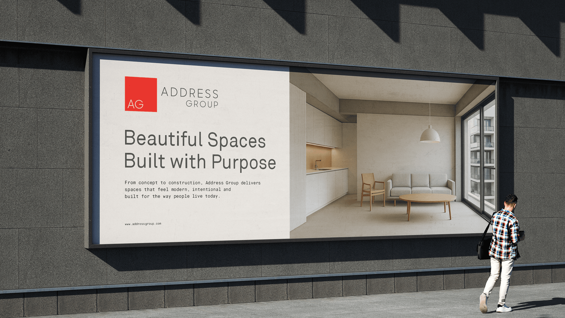
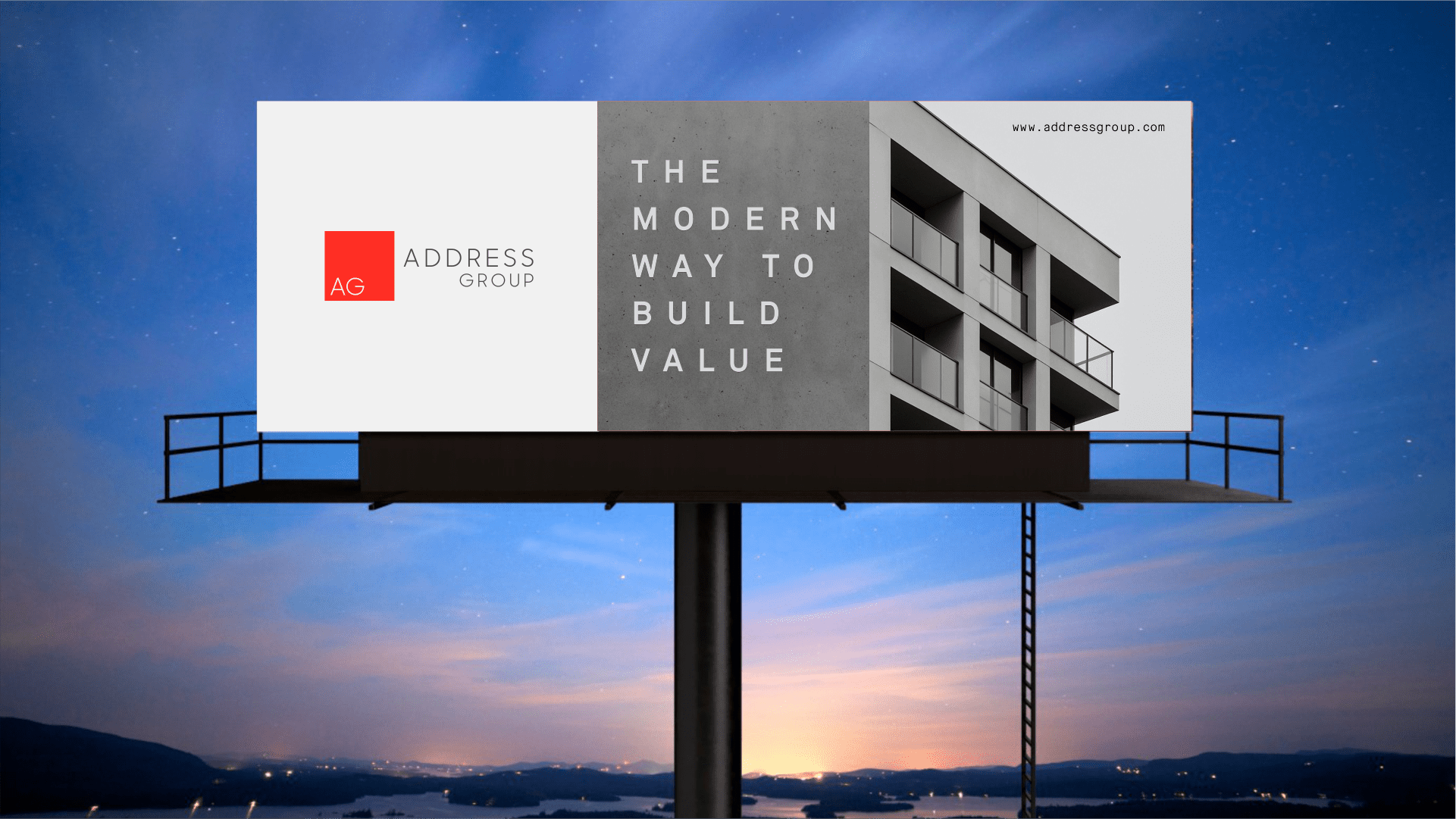
The Address Group identity is built with clear architectural structure, allowing it to work effortlessly across site hoardings, print materials, and digital platforms. It stays consistent, readable, and refined at every scale.
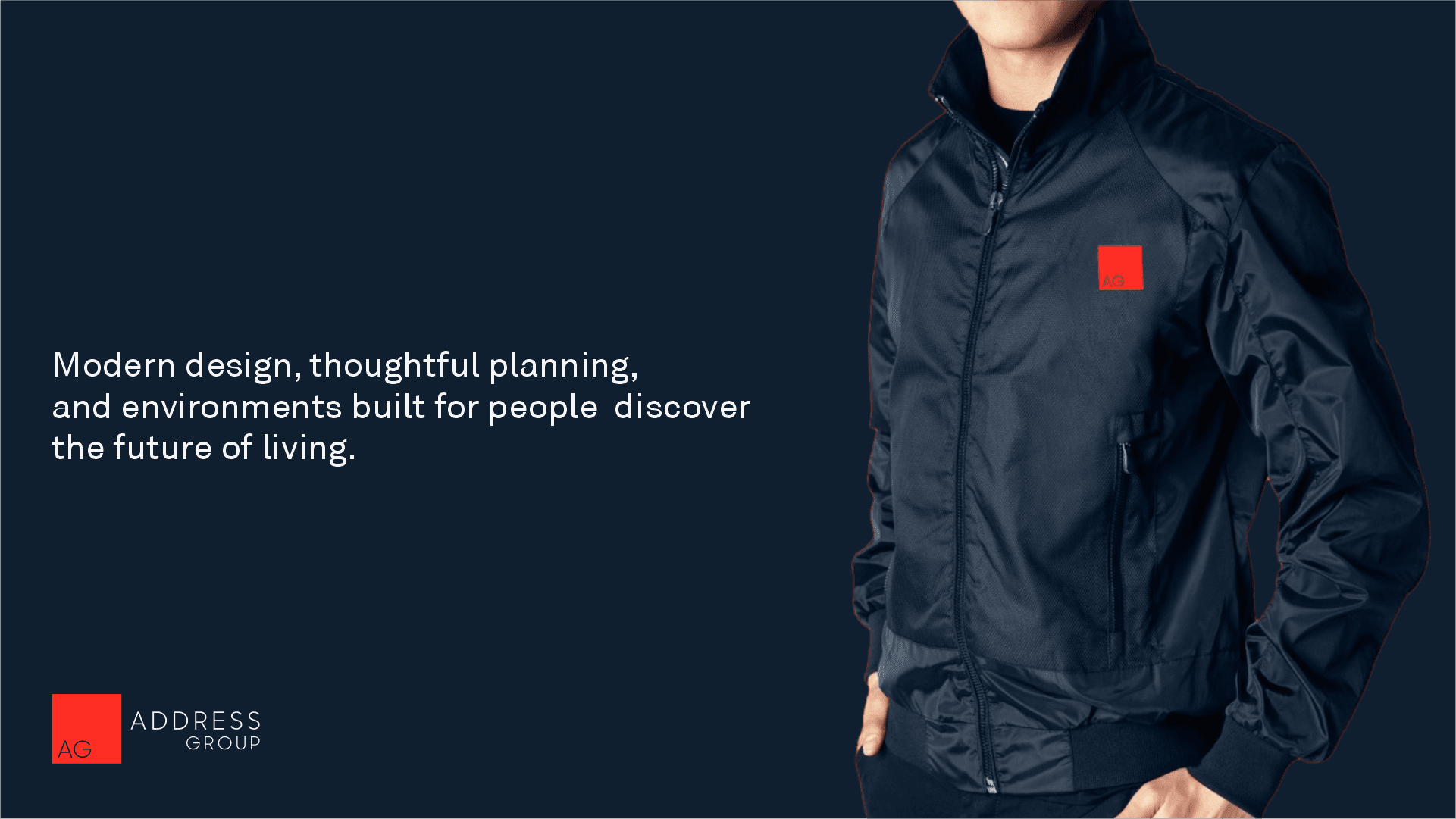
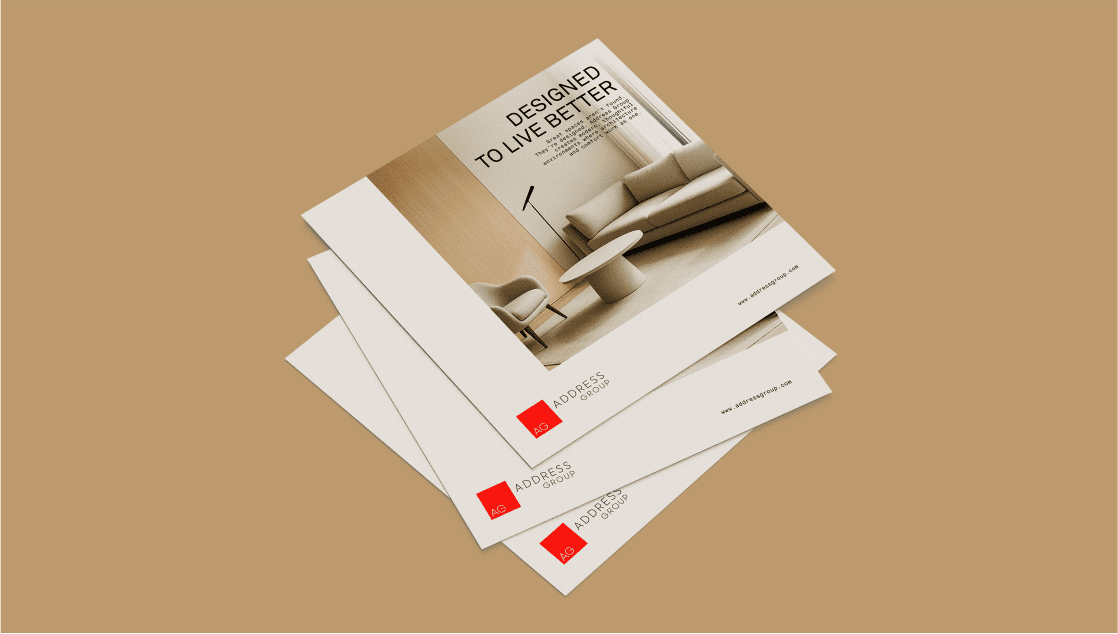
The new identity carries through on-site signage, printed materials, and digital platforms, each application reflecting Address Group’s focus on modern design, clear structure, and long-term value.
The rebrand strengthened Address Group’s presence across investor decks, on-site environments, and digital touchpoints. The updated identity reflects a modern, design-driven real estate company with a clear and confident visual voice.
The new identity strengthens Address Group at every touchpoint, from site signage to investor presentations. Its clear architectural style brings a modern, confident voice to the brand and builds stronger recognition and trust.
Keystone delivered a world-class brand identity for us. Clean, modern, and strategically on point. Our presentations, site signage, and digital presence have never looked this strong.
Mark Henderson, Founder, Address Group
www.addressgroup.com
Great developments deserve great design. We build identities
that sell spaces and give every project a competitive edge.
If my work aligns with your vision, and you value design built on trust, precision, and integrity
let’s create something enduring together.
At Keystone Identity, I believe in genuine partnerships where strategic thinking meets creative craftsmanship.
I look forward to connecting and building a foundation your brand can stand on.
Let’s get started.

