Alliance Builders
Austin, TX
Logo Design • Brand Identity System
Alliance Builders is a U.S.–based general contracting company specializing in franchise build-outs for major brands such as Crumbl Cookies, Thrive Vet Care, and The Lash Lounge. Their work lives at the intersection of speed, precision, and dependability — delivering fully operational franchise locations under extremely tight timelines.
With clients who expect the efficiency of a top-tier corporate partner and the agility of a specialized contractor, Alliance needed a brand identity that matched their reputation: sharp, technical, reliable, and always in motion.

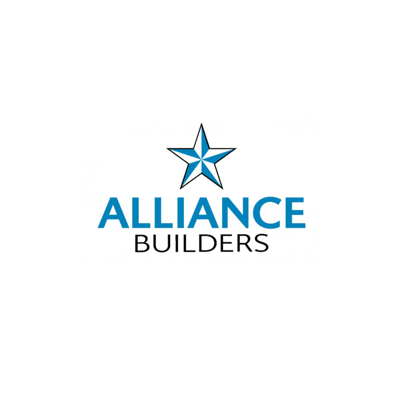
Old Logo — The Star Emblem
The previous Alliance Builders logo featured a five-point star placed above a simple wordmark. While the symbol conveyed patriotism and general “American construction” themes, it lacked the sharp, technical precision the brand truly represents. The star shape was friendly but generic — commonly seen across dozens of contractors, government programs, and service companies. It did not communicate speed, engineering, or franchise-level execution.
Limitations of the old mark:
-
Generic star symbol used widely in the industry
-
Lacked a sense of motion or structural strength
-
Did not reflect modern, high-performance construction
-
Weak adaptability across technical and digital environments
-
No unique geometry that clients could instantly recognize
New Logo — The Engineered ‘A’ Structure
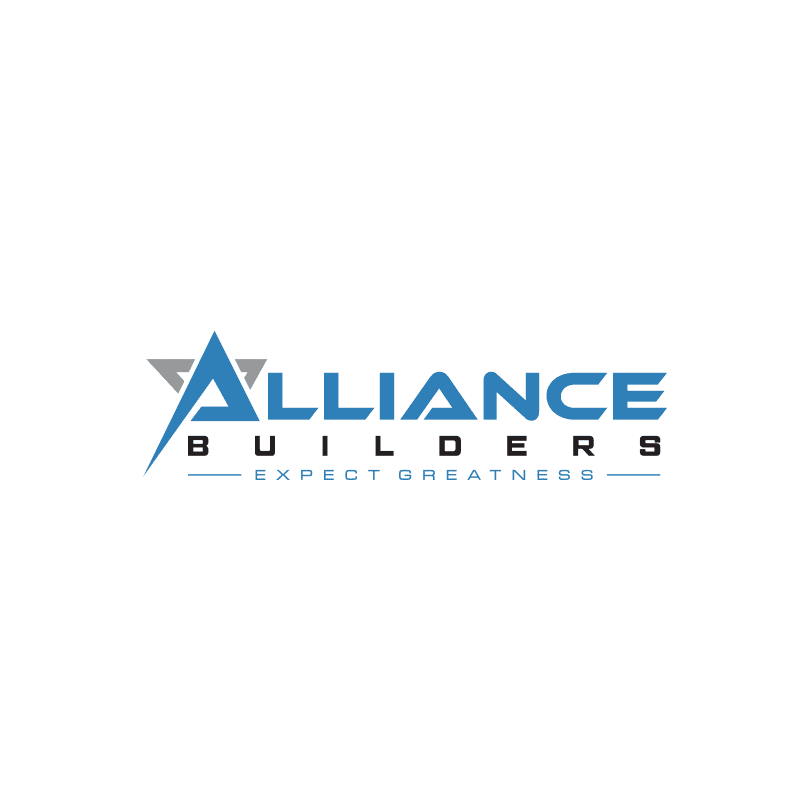
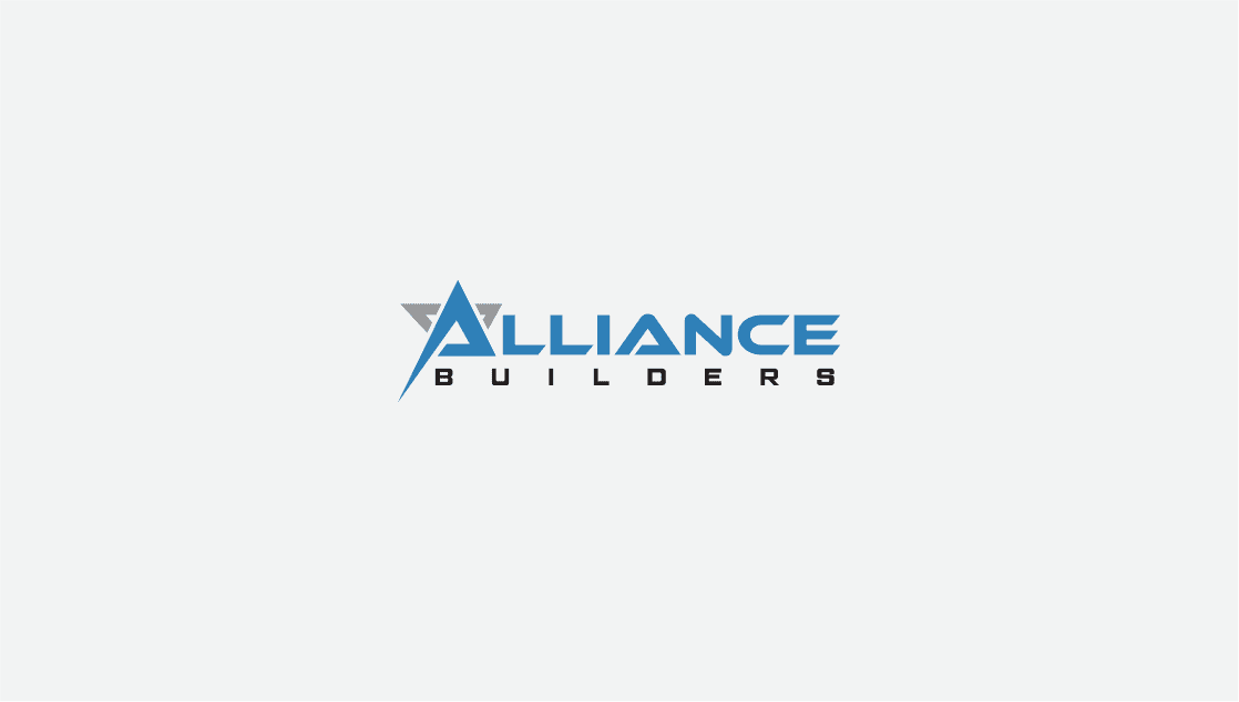
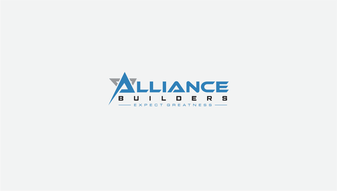
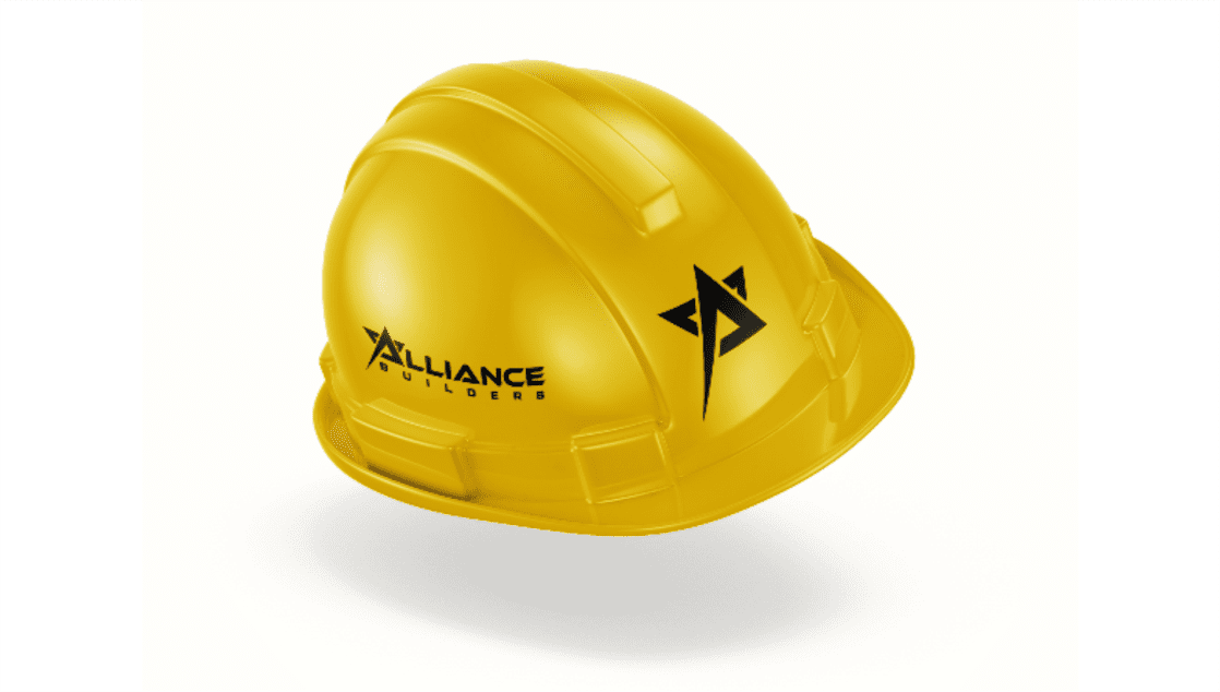
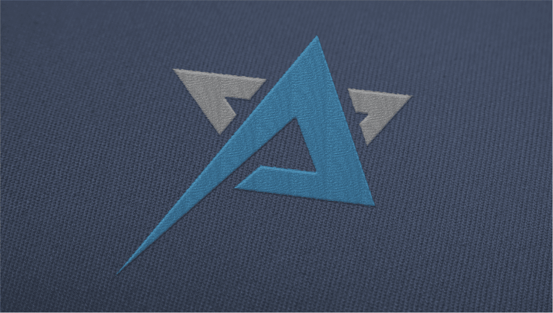
The new Alliance Builders identity replaces the generic star with a structural, architectural A-form — a shape engineered with precision angles and a forward-leaning stance.
It communicates progress, speed, and confidence.
This geometry aligns directly with franchise construction: fast, engineered, and consistent.
Why the new logo works:
-
Bold, architectural geometry = strong engineering personality
-
Forward-leaning angle = motion, speed, and action
-
Unique silhouette that is instantly recognizable
-
High-contrast structure works in all environments (blueprints, job sites, signage, digital)
-
Matches the energy of “Tony Stark–style contracting” — sharp, technical, high-performance
Brand Message Upgraded:
Old logo = “We build things.”
New logo = “We build fast, precise, and at franchise scale.”
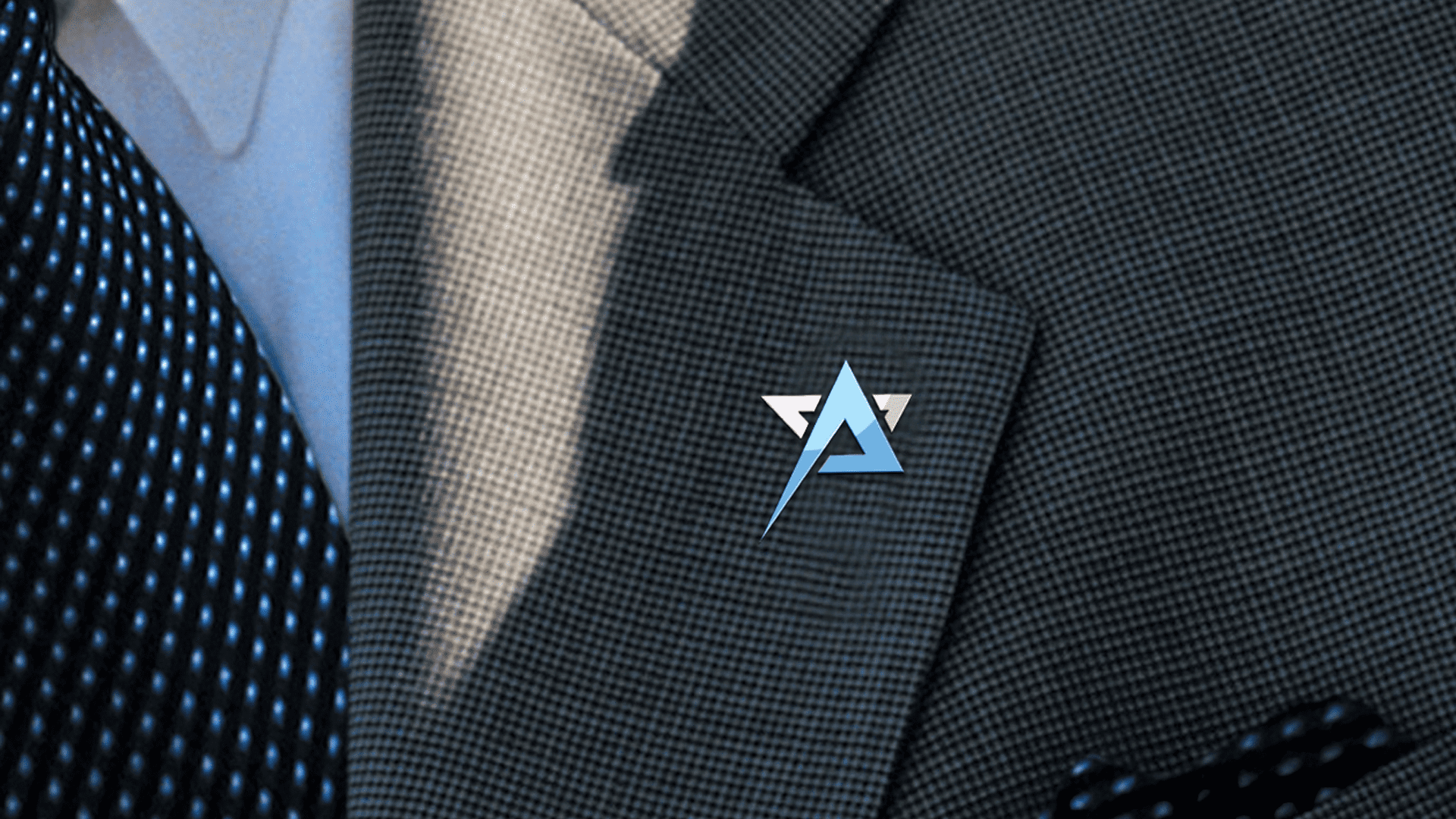
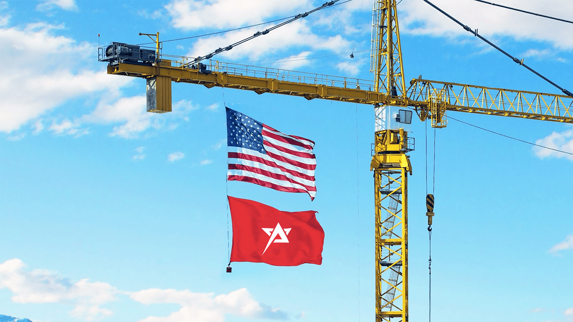
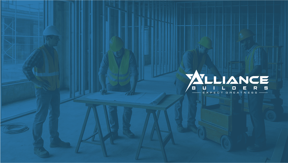
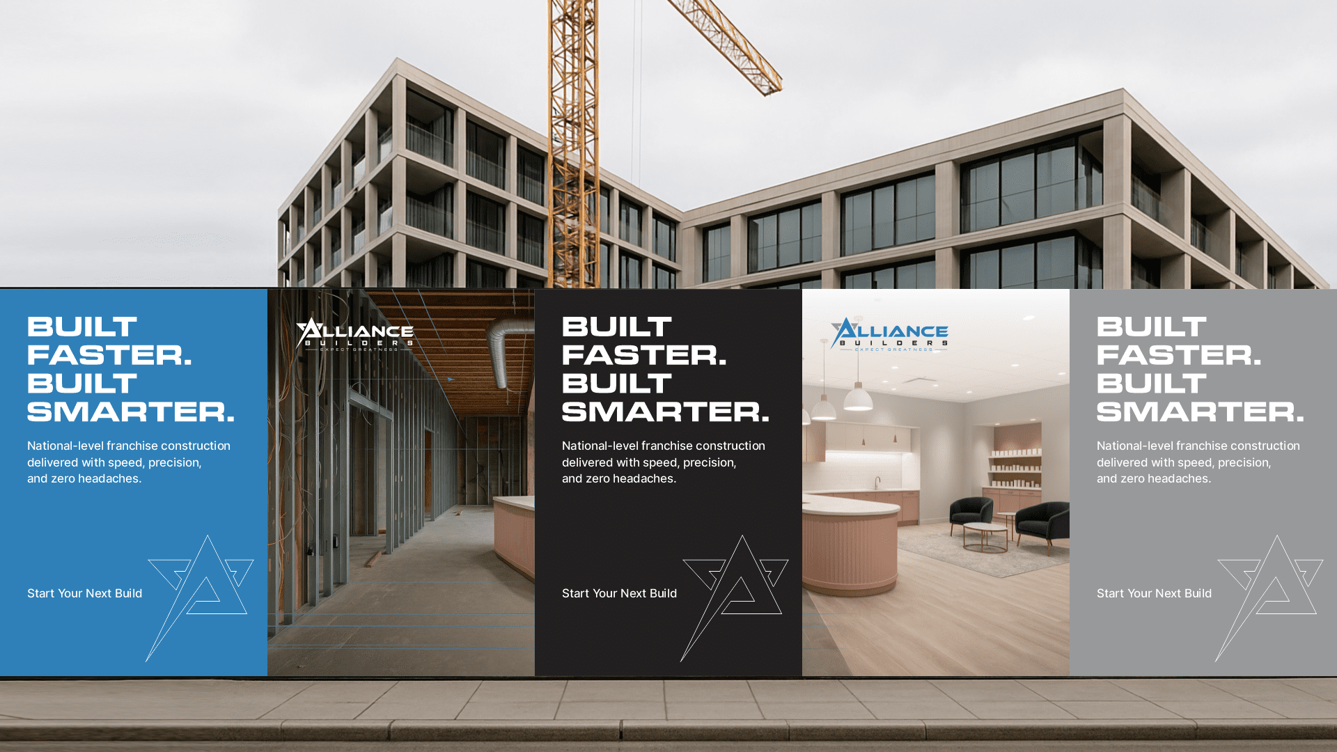
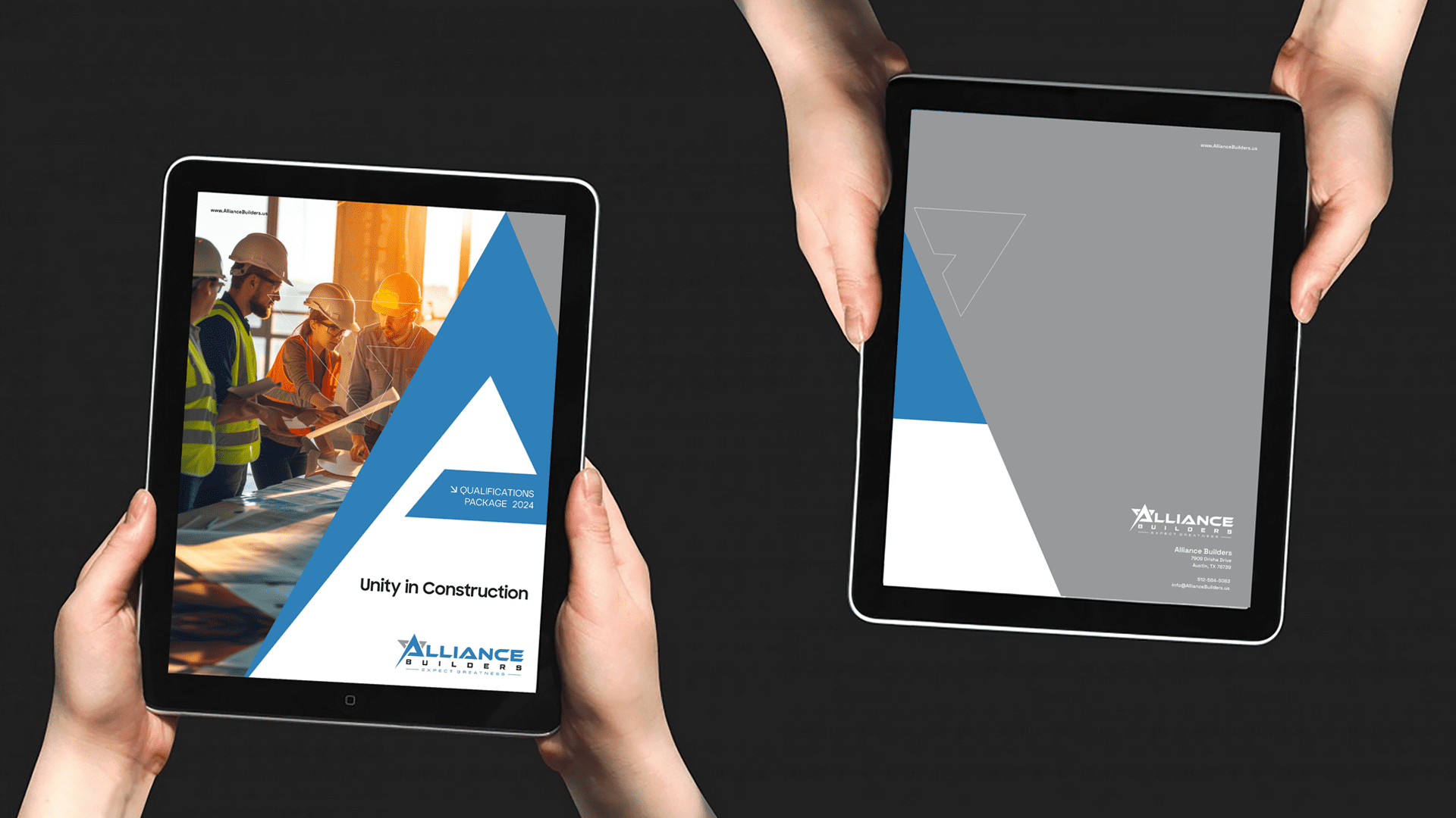
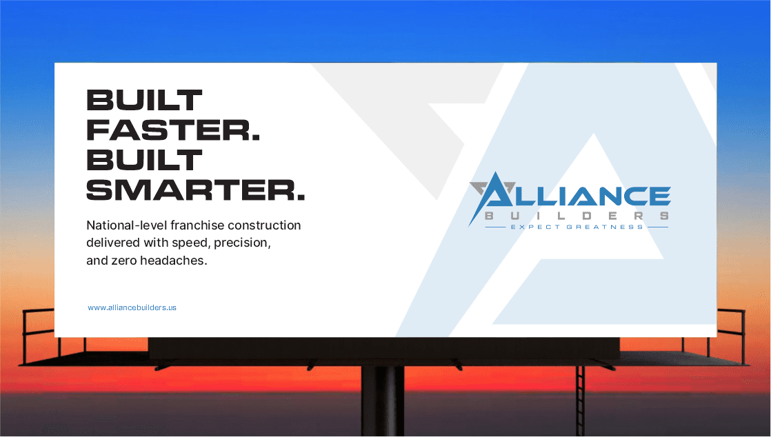
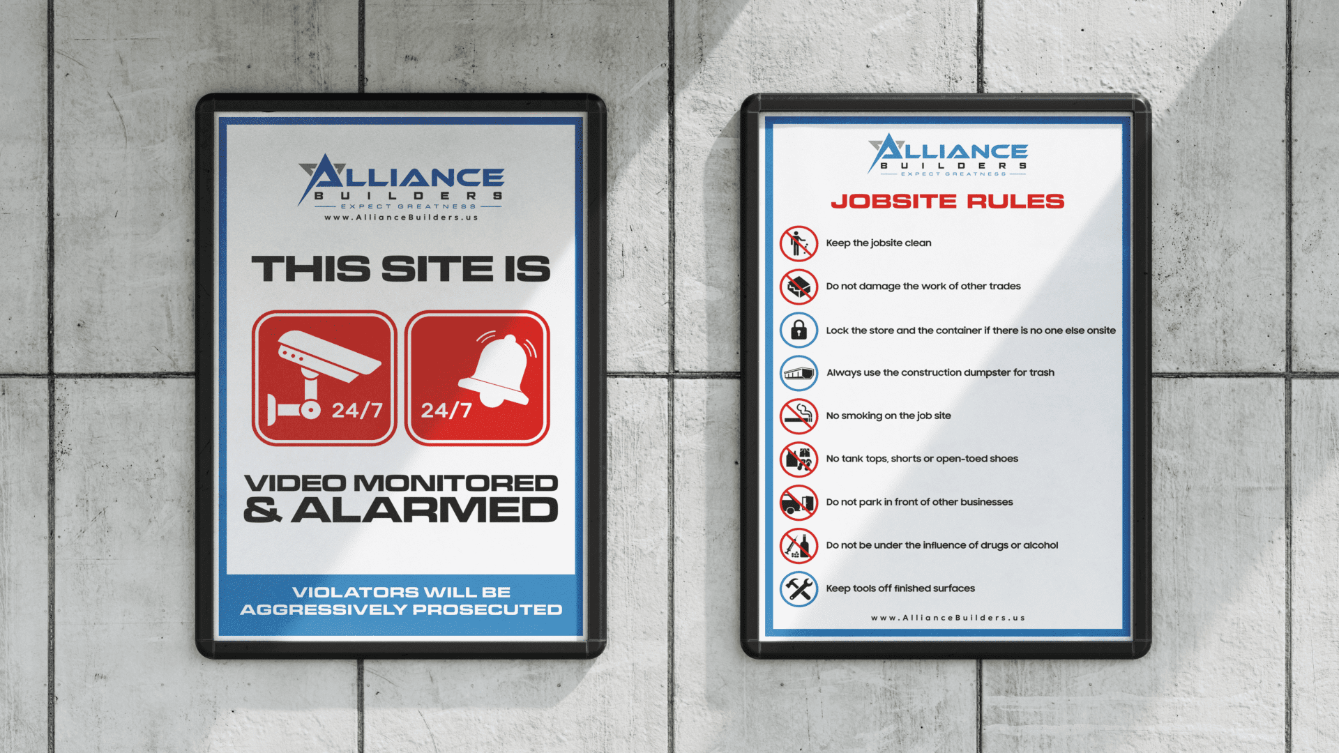
The new Alliance identity works everywhere from busy job sites to franchise presentations and digital platforms. It delivers clear, precise and reliable communication at every level.
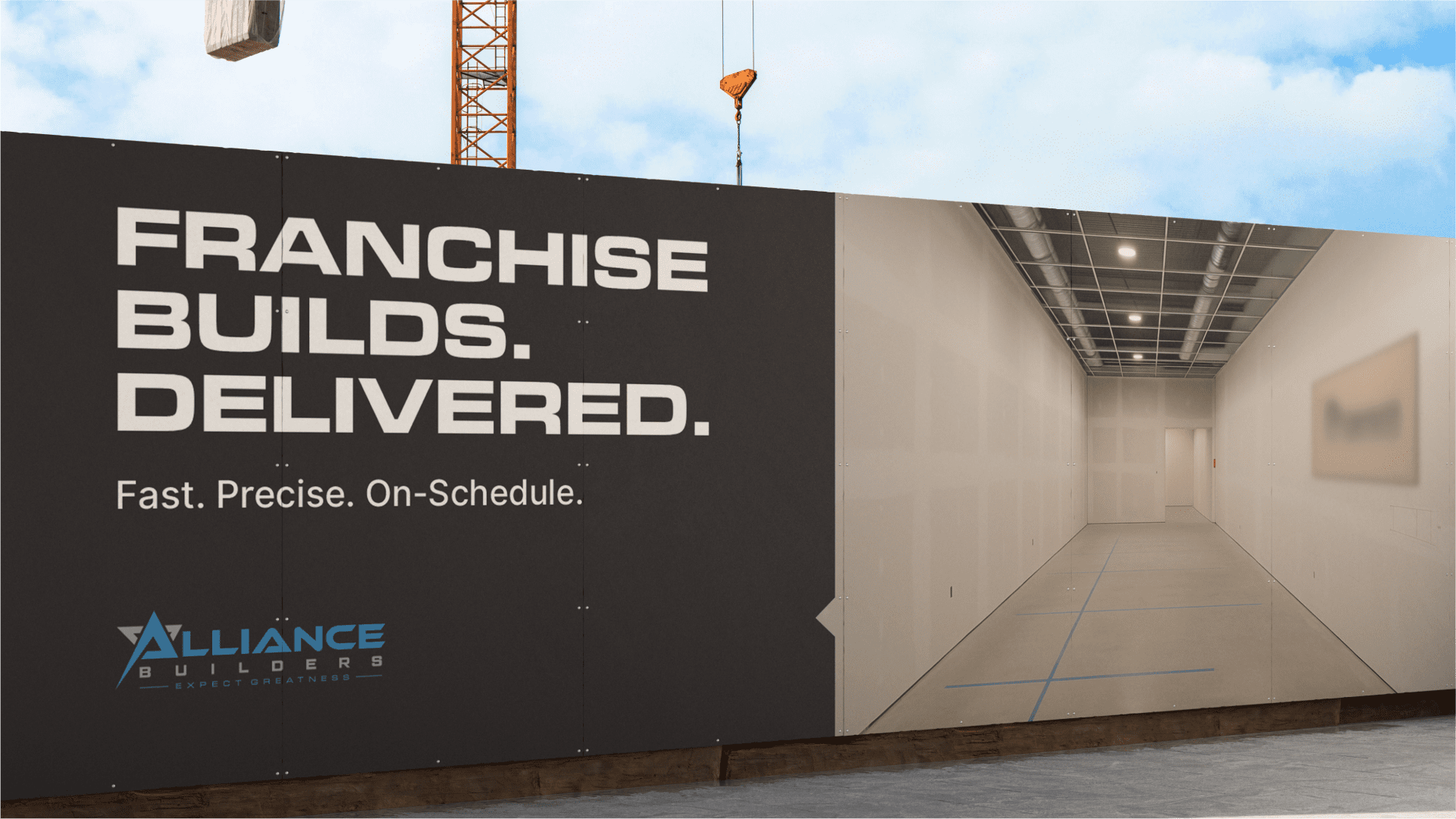
The identity works cleanly across drawings, job-site signage and digital platforms, keeping every application accurate, consistent and dependable.
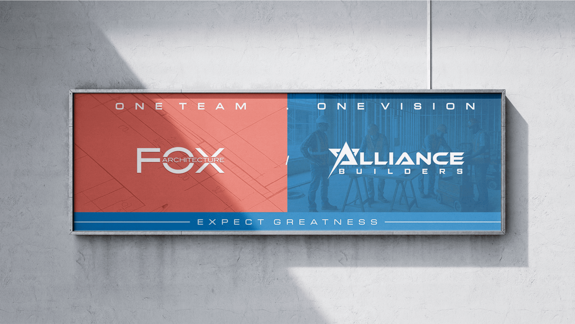
The refreshed identity strengthens Alliance Builders across franchise presentations, job sites and digital platforms. It reflects a contractor known for precise execution, dependable delivery and on-schedule performance.
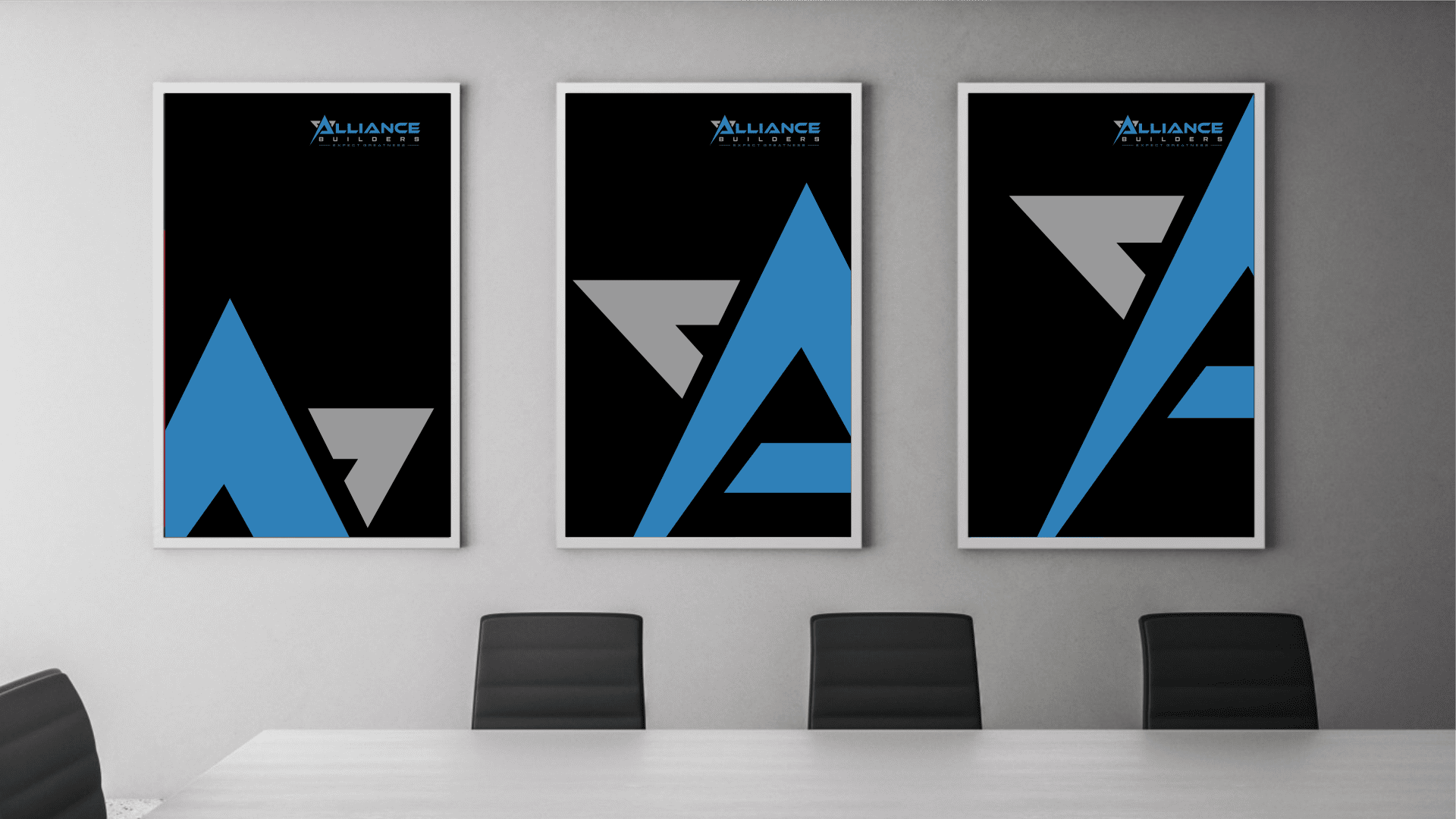
The identity elevates Alliance Builders across job sites, presentations and digital touchpoints. A clear, precision-driven system builds trust, improves recognition and reflects their commitment to fast, reliable franchise construction.
Keystone Identity gave us a brand that finally matches the precision and professionalism of our work. Our clients see the difference instantly.
— Brad White, VP Operations, Alliance Builders
www.AllianceBuilders.us
Built fast. Built precise. Built to outperform.
If my work aligns with your vision, and you value design built on trust, precision, and integrity
let’s create something enduring together.
At Keystone Identity, I believe in genuine partnerships where strategic thinking meets creative craftsmanship.
I look forward to connecting and building a foundation your brand can stand on.
Let’s get started.

