Pacific Palms Apartments
Brand Identity Case Study
San Diego • Clairemont Community • Studio & One-Bedroom Living
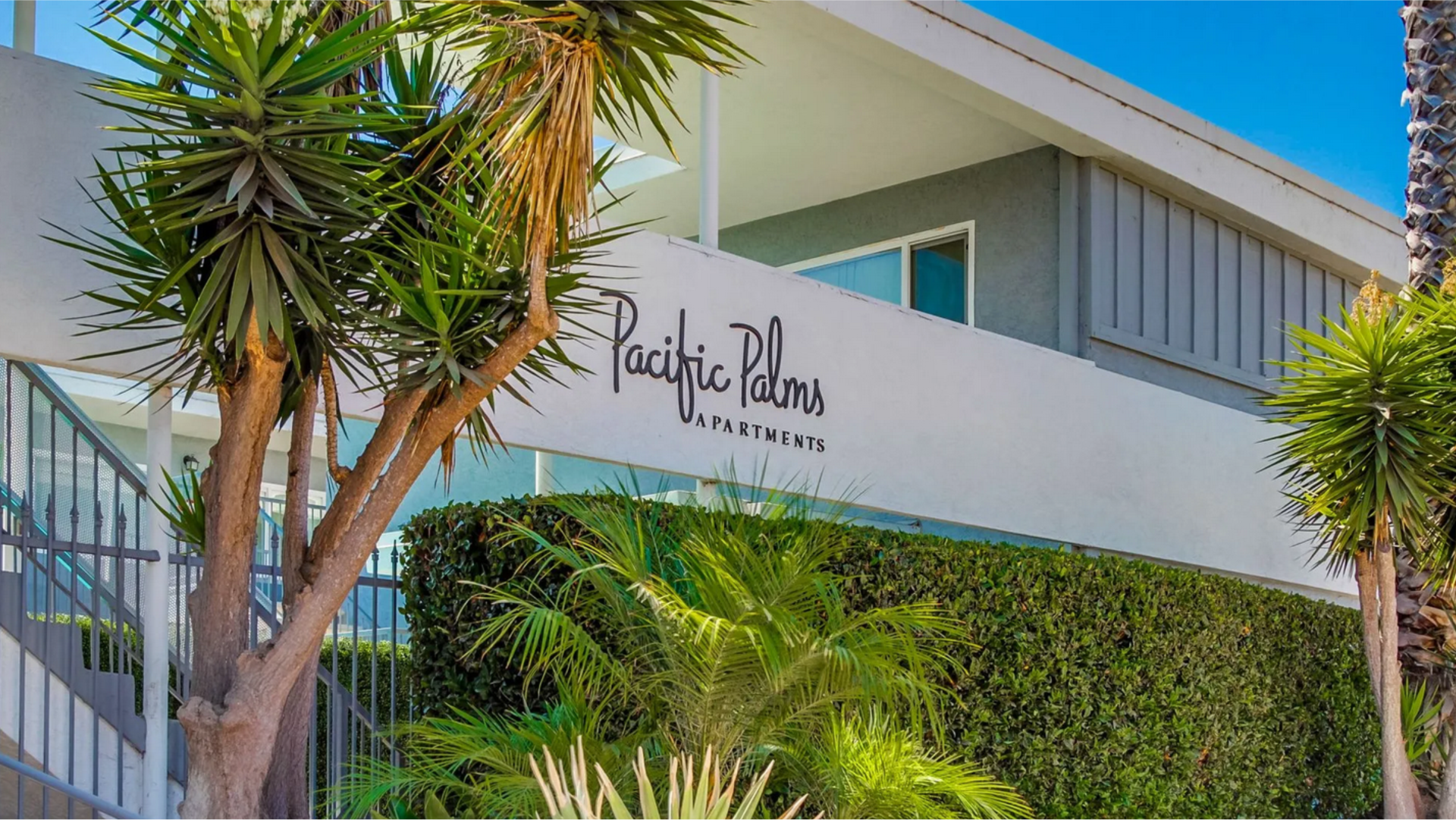
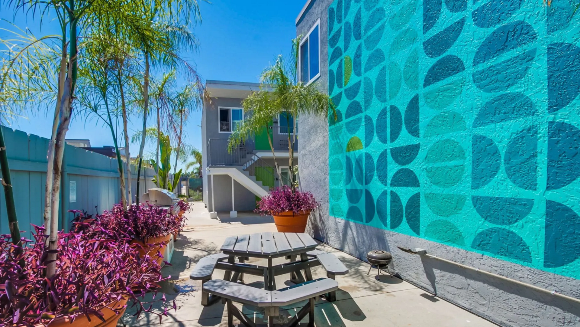
Pacific Palms is a long-standing apartment community located in Clairemont, north of Downtown San Diego. With studio and one-bedroom homes, two pools, outdoor grilling areas, and a walkable neighborhood full of shops and recreation, the property draws students, young professionals, and long-term renters looking for comfort without complexity.
Despite its strong location and amenities, the digital presence wasn’t reflecting the real experience of living at Pacific Palms. The brand felt outdated, the content lacked clarity, and the visual storytelling didn’t match the everyday warmth and convenience the community provides.
The goal was to create a clearer, more modern identity system that communicates what the property truly offers: reliable comfort, a vibrant neighborhood, and a professionally managed living experience.
The Challenge
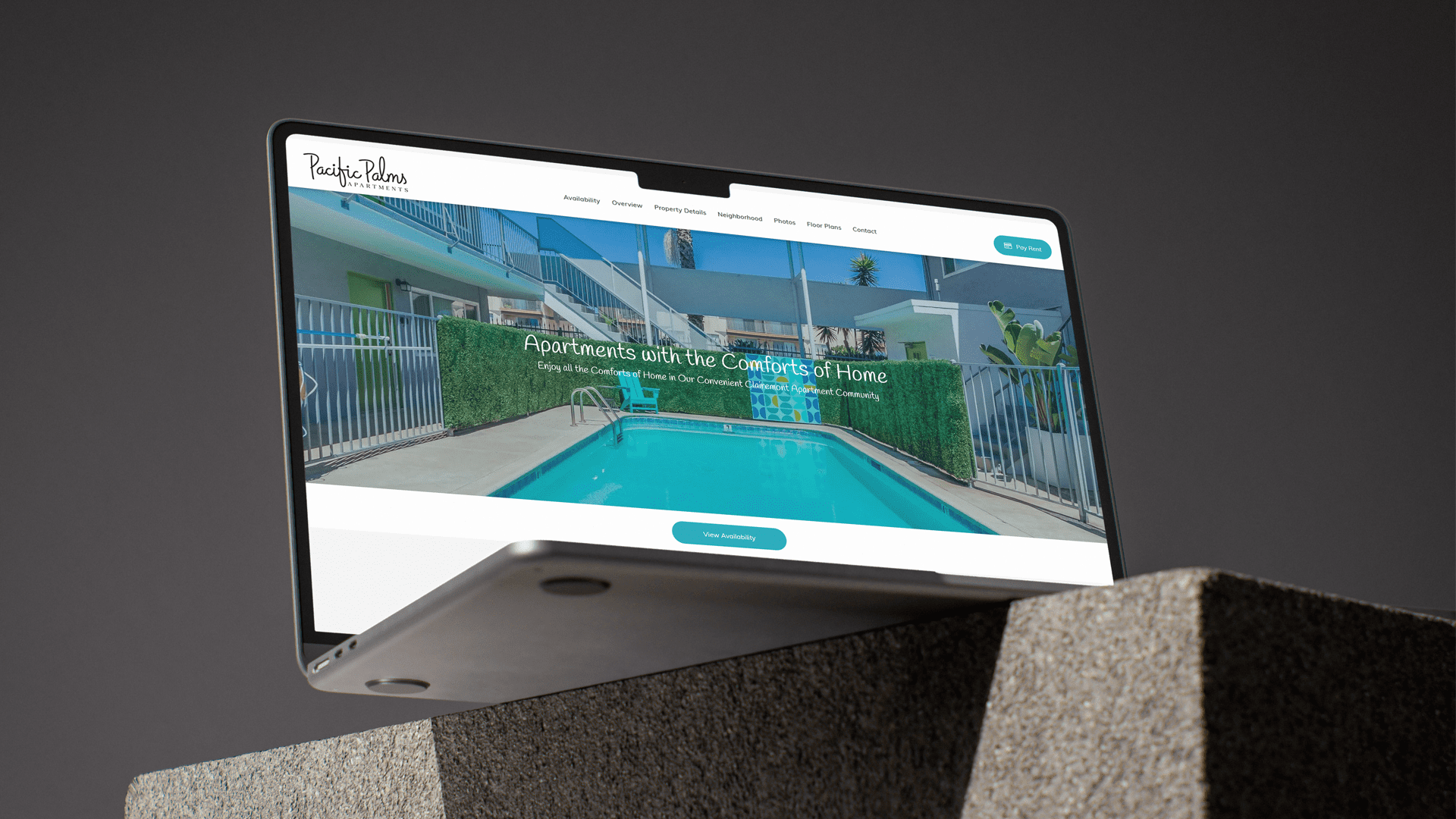
The existing brand materials felt disconnected from the renovated interiors, well-maintained amenities, and friendly atmosphere residents enjoy. Photography was inconsistent, messaging was generic, and the website required multiple clicks to reach essential information like availability, amenities, or neighborhood highlights.
We needed an identity that organized information visually, made browsing feel smooth and intuitive, and restored trust by showing the property as it actually is: clean, efficient, and well cared for.
Our Approach
The new identity was built around a friendly, welcoming tone that mirrors the community’s approachable lifestyle. Messaging was rewritten to highlight real advantages — thoughtful layouts, two pools, outdoor gathering spaces, renovated interiors, and easy online rent payments.
The design direction adopted a calm, sun-lit aesthetic inspired by the Clairemont neighborhood. Layouts were simplified, spacing modernized, and the content hierarchy rebuilt to lead prospects directly to what matters most: availability, floor plans, and community living.
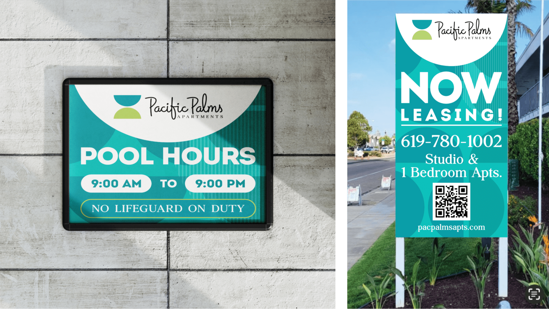
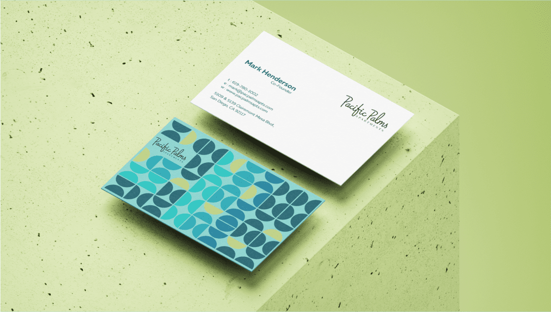
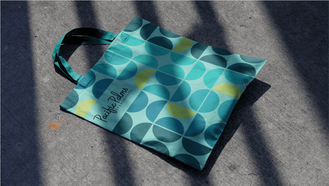
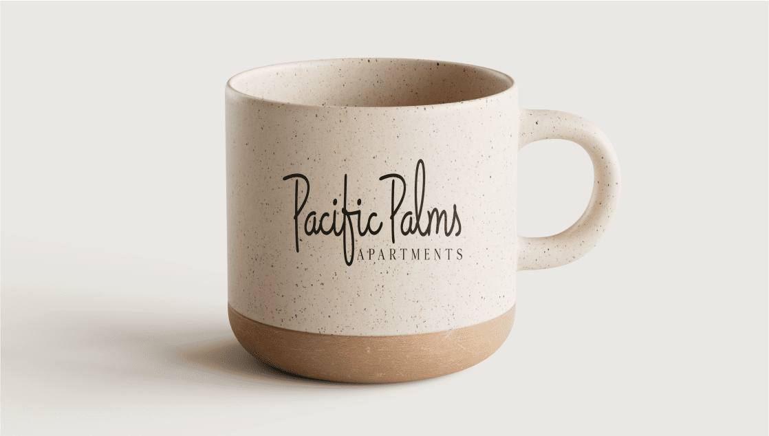
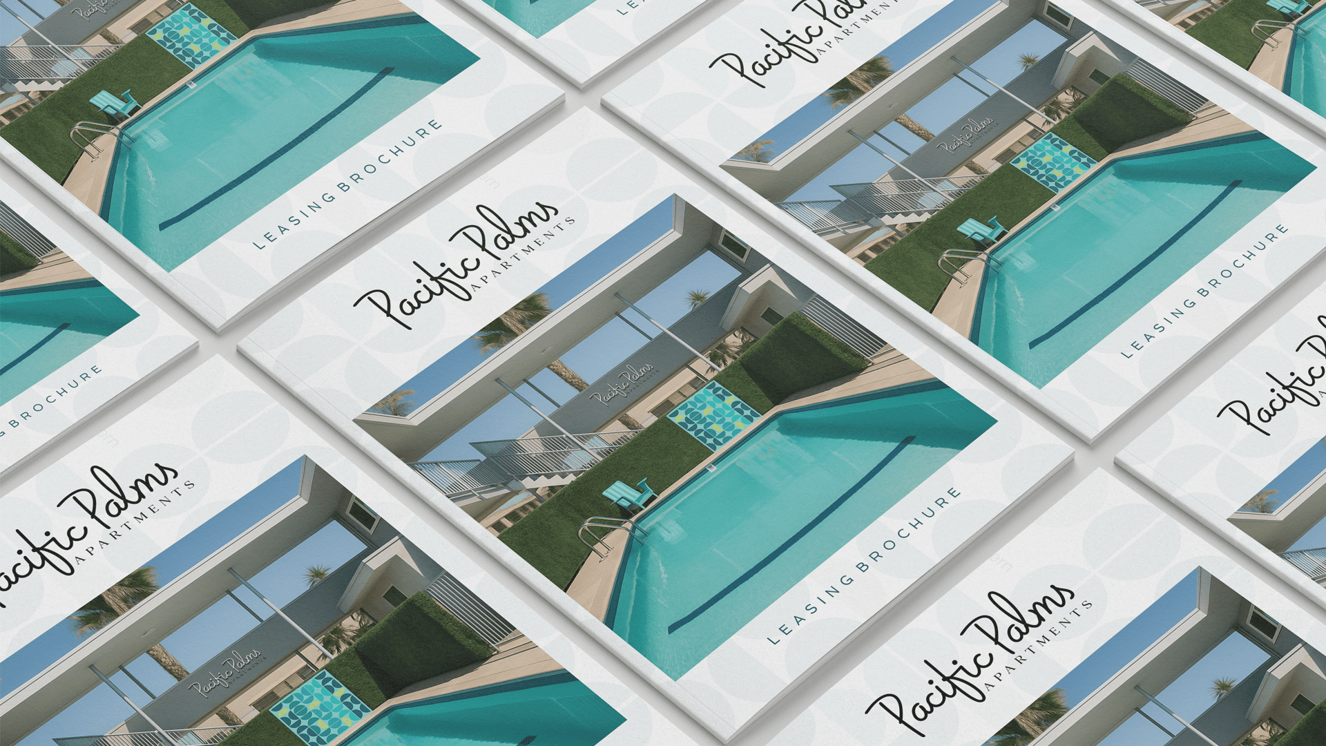
The refreshed identity gives Pacific Palms a cleaner and more welcoming presence across every touchpoint, from leasing materials and floor plan cards to online listings and neighborhood pages. Wherever it appears, it delivers the same sense of comfort, clarity, and reliable community living.
The refreshed identity extends across the entire Pacific Palms experience, from leasing materials and floor plan visuals to property listings and resident communications. It brings a clear and consistent presence wherever future renters interact with the community.
The updated identity strengthens Pacific Palms across its leasing materials, digital listings, and resident touchpoints. It now presents the community as a dependable, well-managed place to live, offering comfort, clarity, and a consistent experience for future renters.
The refreshed identity elevates Pacific Palms across every touchpoint, from online listings to leasing materials and resident communications. The clearer visual system builds trust, strengthens recognition, and presents the community as a welcoming, well-managed place to call home.
Working with this team for the second time has been just as smooth as the first. They understood exactly what Pacific Palms needed and delivered a clean, modern identity that feels true to our community. It has already made a real difference in how renters see us.
Mark Henderson, Founder, Pacific Palms Apartments
www.pacpalmsapts.com
Every community deserves an identity that feels as welcoming and dependable as the place itself.
You May Also Like
If my work aligns with your vision, and you value design built on trust, precision, and integrity
let’s create something enduring together.
At Keystone Identity, I believe in genuine partnerships where strategic thinking meets creative craftsmanship.
I look forward to connecting and building a foundation your brand can stand on.
Let’s get started.

